
Brand Guidelines
Logos, colors, type and usage rules for the Fiber Clarity name.
Using the Fiber Clarity Brand
Fiber Clarity LLC is a California licensed C-7 contractor building fiber optic and network infrastructure for government, defense, telecom and commercial projects. These guidelines keep every use of our name precise and consistent.
Everything here is free to download. Use the files as they are; please do not redraw, recolor or retype the logo.
Who Is This For?
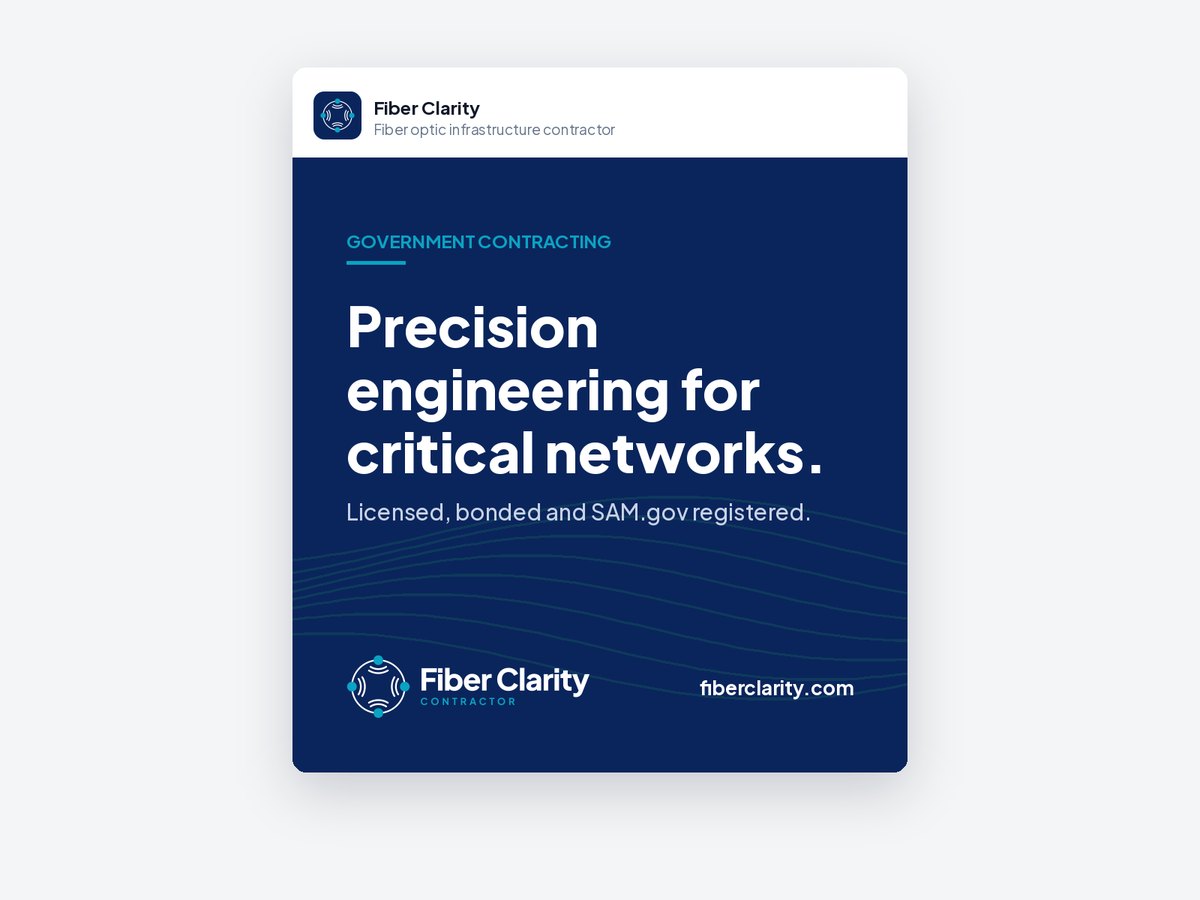
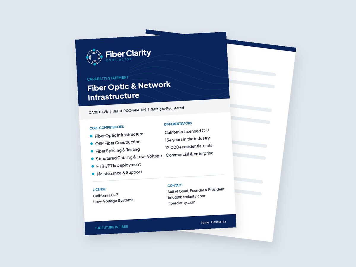
Agencies, prime contractors and teammates adding Fiber Clarity to proposals, capability decks and sponsor walls.
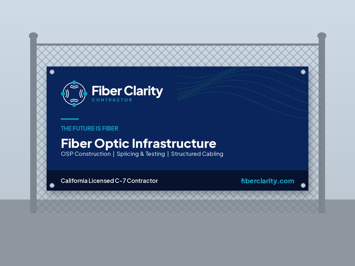
Event organizers, media, printers and sign shops producing materials with our name on them.
Our Logo
A ring of fiber with four nodes, each sending signal inward: connection at every point. Use the color logo on white and the reversed logo on navy.

Choose the Right Version
Horizontal for wide spaces, stacked for square ones, and one-color versions for single-ink printing.



The Fiber Clarity Icon
Use the icon on its own once the name already appears, and for avatars, app tiles and favicons.


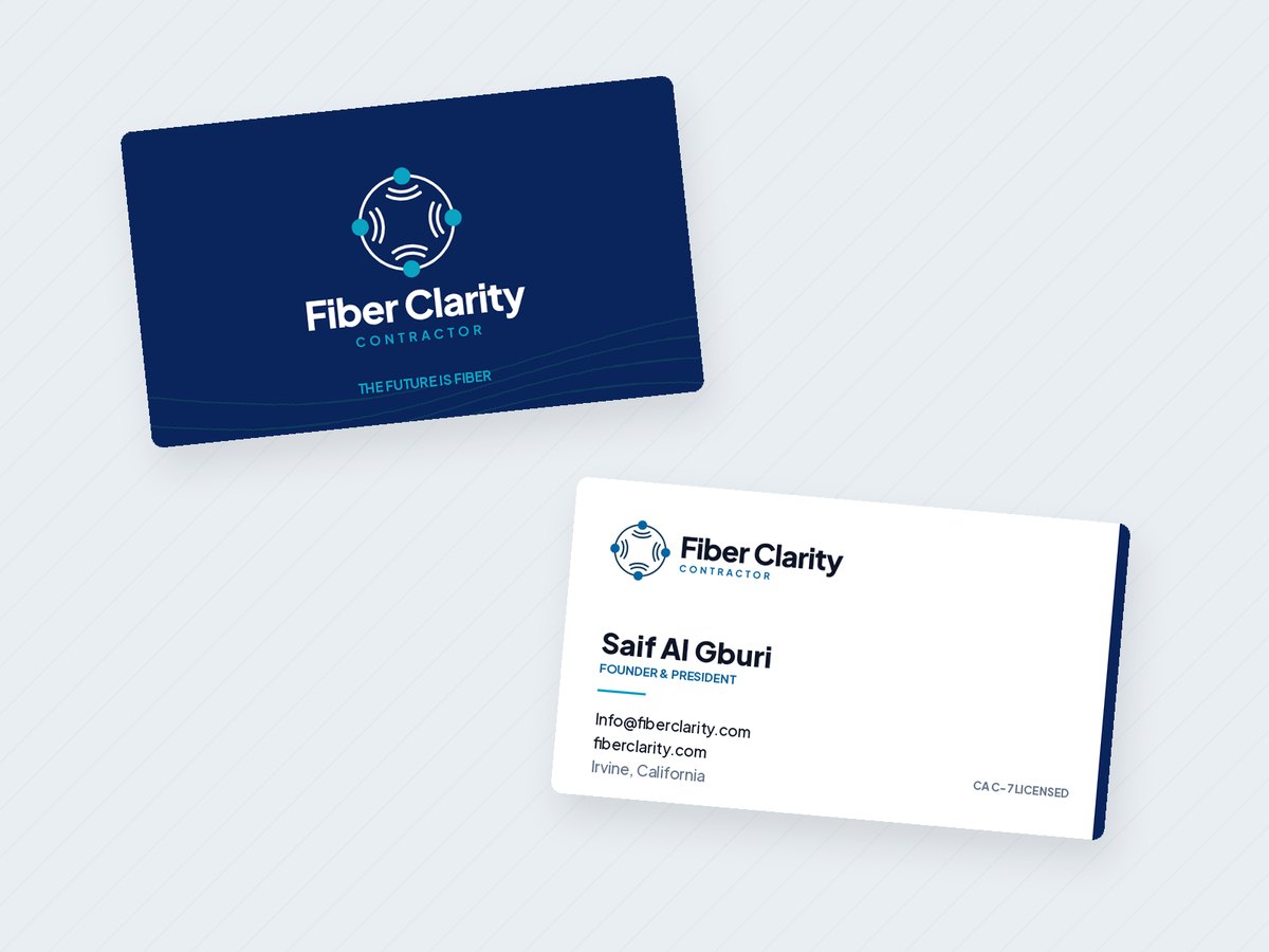
Using the Logo Well
Keep clear space equal to one node diameter on every side. Nothing else enters that space.
Horizontal logo at least 140px or 35mm wide. The icon alone at least 24px or 6mm.
Color on white or light gray, reversed on navy or dark photos, one-color for single-ink print.
Logo Misuse
Color Palette
Shades of blue only. Lead with Fiber Navy and white, and use Signal Cyan sparingly. Click a color to copy its HEX value.
Plus Jakarta Sans
One typeface for everything, exactly as on fiberclarity.com. Headlines ExtraBold or Bold, body Regular, labels Medium or SemiBold.
Writing Our Name
- Fiber Clarity
- Fiber Clarity LLC (legal and contract documents)
- The Future Is Fiber (tagline, uppercase)
- FiberClarity
- Fiber clarity
- Fibre Clarity
- FC (in public-facing copy)
Need a File You Don't See Here?
Email Info@fiberclarity.com and we will send the right format.